[ToDoList] Materialize I: Basic Layout
In the Materialize landing section we installed and configured the packages required to run MaterializeCSS with our ToDoList app via Webpack
This section will cover the basic layout of each page, focusing on the header and footer elements as well as the initialisation of the JavaScript components.
With materialize-css up and running on the app, we are ready to start using it to beautify our app.
From here, we can scour the Materialize site and pick out components we want to steal.
Let's start with a header and a navigation bar.
First we'll head to the Navbar page on the Materialize site to see what we need to do.
This page will give you a number of options for you to choose from that offer different features, alignment options and button usage. For our purposes, I think the Navbar Dropdown Menu will do very well - we can add our To-Do items into this dropdown very nicely.
For our header to be present on all pages, we will need to add it to our application.html.erb template. We can save ourselves a refactoring step later on and, as we learned before,
add this via a partial. In this, we will copy the code for the dropdown navbar from the Materialize documentation and iterate over a Todo.all array,
which we have limited to the first 5 elements, to provide our list of items in the dropdown (also truncating the names so a long name doesn't trash our styling)!
We'll also remove some class options so that we don't lose our menu on smaller screens.
Since we already had a partial for navigation, let's just replace the contents of this - /app/views/layouts/_navigation.html.erb
<header>
<ul id="nav-dropdown" class="dropdown-content">
<% Todo.all[0..-4].each do |todo| %>
<li><%= link_to "#{todo.id}: #{truncate(todo.name, length: 40)}", todo_path(todo) %></li>
<li class="divider"></li>
<% end %>
<li><%= link_to 'To-Do List', todos_path %></li>
<li class="divider"></li>
<li><%= link_to 'New To-Do item', new_todo_path %></li>
</ul>
<nav>
<div class="nav-wrapper">
<%= link_to root_path, class: 'brand-logo left' do %> ToDoList<% end %>
<ul class="right">
<li><%= link_to 'Home', root_path %></li>
<li><%= link_to 'About', about_path %></li>
<li><%= link_to 'Help', help_path %></li>
<!-- Dropdown Trigger -->
<li>
<a class="dropdown-trigger" href="#!" data-target="nav-dropdown">
To-Do Items <i class="material-icons right">arrow_drop_down</i>
</a>
</li>
</ul>
</div>
</nav>
</header>application.html.erb, we can now reload our page to see our glorious navigation bar!

This looks lovely so far. However you might notice that when we try to activate the dropdown, nothing seems to happen! Observant as you are, you'll possibly have noticed the note below the code for the dropdown navbar on the Materialize site explaining that some JavaScript is needed to activate it - after all, anchors don't normally behave like dropdown menus!
To make things a lot easier for us, we won't use the specific snippet mentioned in the navbar page - instead we will use another bit of Materialize magic and Auto Initialise the framework's JavaScript!
To do this, we need to run the required line of JS (M.AutoInit();) after the document has finished loading, and place this in a script tag
at the bottom of the body tag of all of our HTML pages.
Luckily, we can easily achieve this via another partial in our template - /app/views/layouts/_scripts.html.erb:
<script>
  document.addEventListener('DOMContentLoaded', function() {
    M.AutoInit();
  });

  if (document.readyState!='loading') {
    M.AutoInit();
  };
</script>
Finally we'll add this partial to the view template, below the yield tag so that it is rendered at the bottom of the <body> tag
- app/views/layouts/application.html.erb:
<%= render 'layouts/scripts' %>

With our header set up, let's move to the other end and do a footer! Unlike headers however, Materialize only offers a single footer format which we can quickly grab and replace the bits we want to change. To use this effectively, we will need to quickly learn about the grid layout features that give us almost complete control over the layout of our site: containers, rows and columns.
The Grid page of the Materialize site explains these better than I can, but put simply:
-
A container contains page content by giving it a horizontal margin and some other funky bits.
These are declared asdivelements with thecontainerclass. -
A row separates page content into sections placed in descending order, with each row containing 12 columns.
These are declared asdivelements with therowclass.- Don't confuse these with
sectiondivs, which are for specifically separating lots of content.
- Don't confuse these with
-
A column separates a row into, well, columns - how many columns the div spans depends on the argument you pass it.
These are exceedingly clever and can discern between small, medium, large and extra-large (HD+) screens, but default to small.
These are declared asdivelements with thecolclass and the number of columns of span.- Also, if a divs spans all 12 columns, the next div will be placed below it automatically!
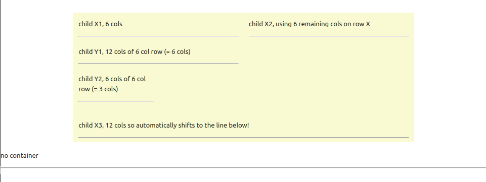
If that explanation just left you more confused, this might show it better:
<div class="container" style="background-color: lightgoldenrodyellow">
  <div class="row">               <!-- row X -->
    <div class="col s6">          <!-- child X1, 6 columns wide -->
      <p>child X1, 6 cols</p><hr />
      <div class="row">           <!-- row Y -->
        <div class="col s12">     <!-- child Y1, all 12 columns of the new row (which is 6 columns from child X) -->
          <p>child Y1, 12 cols of 6 col row (= 6 cols)</p><hr />
        </div>
        <div class="col s6">      <!-- child Y2, 6 columns wide of the 6 columns from child X == 3 child X columns -->
          <p>child Y2, 6 cols of 6 col row (= 3 cols)</p><hr />
        </div>
      </div>
    </div>
    <div class="col s6">          <!-- child X2, spanning the remaining 6 columns of row X -->
      <p>child X2, using 6 remaining cols on row X</p><hr />
    </div>
    <div class="col s12">         <!-- child X3, spanning all 12 columns of row X on the next available line! -->
      <p>child X3, 12 cols so automatically shifts to the line below!</p><hr />
    </div>
  </div>
</div>
<p>no container</p><hr />
This sorcery is but the tip of the iceberg, however. Remember above that we mentioned that column width can discern between screen sizes? Try adding changing one of the column divs to, for example:
<div class="col s12 m8 l6 xl4">Other elements are also available to assist in positioning your content exactly where you want it, such as:
offsetpushpull
With all this in mind, let's set about designing our footer. Again, it may help if you have mocked up / wireframed how you would like it to look, but this is by no means necessary in this case.
Using the code given to us in Materalize's Footer page as a basis, let's create a happy little footer in a partial
- /app/views/layouts/_footer.html.erb
<footer class="page-footer">
  <div class="container">
    <div class="row">
      <div class="col s12">
        <h5 class="center">ToDoList</h5>
      </div>
    </div>
    <div class="row">
      <div class="col s12 l6">
        <p>This text will appear across the whole row on a small screen, or half the row on a large screen!</p>
        <p>If you think that's cool, it will also use this logic to determine whether the next div lives beside or below this one!</p>
      </div>
      <div class="col s12 l4 offset-l2">
        <h6>Footer Navigation</h6>
        <ul>
          <li><%= link_to 'Home', root_path %></li>
          <li><%= link_to 'About', about_path %></li>
          <li><%= link_to 'To-Do List', todos_path %></li>
          <li><%= link_to 'Create New To-Do Item', new_todo_path %></li>
        </ul>
      </div>
    </div>
  </div>
  <div class="footer-copyright">
    <div class="container">
      Made with love by Not Another Script Kiddie
      <a class="right" href="https://empydoodle.blogspot.com/p/a-british-gentlemans-guide-to-ruby-on.html">Guide / Blog</a>
    </div>
  </div>
</footer><header>, <main> and <footer> blocks.
We already added the required elements for the header and footer in their corresponding partials, so all we need to do is enclose our main body content in a
<main> element in our template, including:
- The
yield - The
messagespartial - Any other partials or content that should appear between the header and the footer
application.html.erb and put the <main> tags in while we're at it
- the body block in ours should look something like:
  <body>
    <%= render 'layouts/navigation' %>
    <main>
      <%= render 'layouts/messages' %>
      <%= yield %>
    </main>
    <%= render 'layouts/footer' %>
    <%= render 'layouts/scripts' %>
</body>@import line) to lock the footer to the bottom of the screen
- /app/javascript/styles/styles.scss:
body {
  display: flex;
  min-height: 100vh;
  flex-direction: column;
}

main {
  flex: 1 0 auto;
}

Now we can sit back, refresh our browser page, grab a Jaffa Cake and bask in the beauty of our work, remembering to commit and push our changes so far if not already done:
$ git status
$ git add -A
$ git commit -m 'Header, footer and JS initialisation'
$ git push origin materialize
| < [ToDoList] Styling with Materialize | | | [ToDoList] Materialize II: Colour & Icons > |
| Back | ||

Comments
Post a Comment