[ToDoList] Materialize II: Colour Variables & Icons
So far in our journey with MaterializeCSS we have learned how to install the packages with Webpacker, set up our basic layout elements and initialise the JavaScript elements
that the framework offers.
This section will explain some of the more CSS-driven aspects of the framework, which we will improve what we have already done so far.
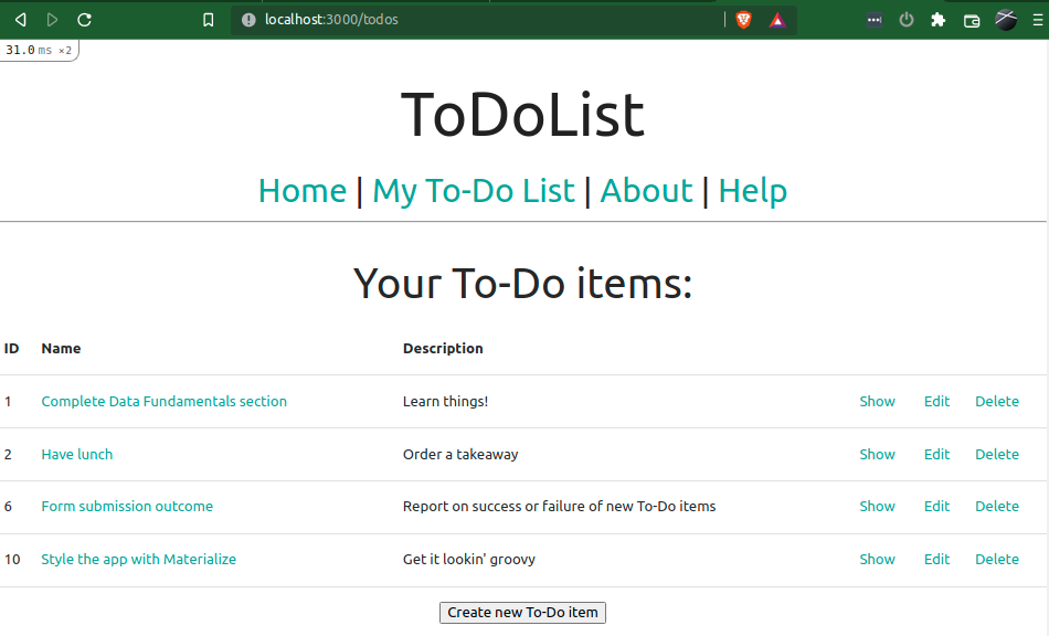
There may come a time when that default pink(ish) and blue colour scheme will get right on your nerves - it didn't take long for me! Let's do something about it and change the colour scheme of our site!
To start with, head over to the Colour page of the Materialize site and pick which colours
you would like to be your primary and secondary colours - for me it is the green darken-3 and teal lighten-1 respectively.
Once you've picked them, head into your stylesheet and import the color-variables schema which you can then use to define your colours
- this should all be placed ABOVE what we already have in there.
Our /app/javascript/styles/styles.scss file should read something like:
@import "materialize-css/sass/components/color-variables";
$primary-color: color('green', 'darken-3') !default;
$secondary-color: color('teal', 'lighten-1') !default;
@import 'materialize-css';

body {
  display: flex;
  min-height: 100vh;
  flex-direction: column;
}

main {
  flex: 1 0 auto;
}With this done, go ahead and refresh your browser and drool over your freshly primary-colour-painted header and footer, as well as your your dropdown links sporting your secondary colour!

This is by no means the extent of what can be defined with variables - head into your /node_modules/materialize-css/sass/components directory to see all of the things that can be
defined.
In particular the _variables.scss file outlines what each variable is referred to as (such as $link-color),
which can be added to the stylesheet in the same way we have done above.
In addition, we can use these variables in regular CSS in our stylesheet - for example, I'd like to change the colour of the links in my footer (and only my footer) to something more visible,
so I will add the following to the bottom of my stylesheet - /app/javascript/styles/styles.scss:
footer a {
  color: color('amber', 'base');
}

With our app really starting to look quite professional, it would be easy to forget that long ago, when we were at the installation phase, we set up another package.
Can you remember what it was?
Wow, you did better than I did, Doctor Brainy Breeches. That's right, we installed the material icons package!
Material Icons were created by Google and fit seamlessly with the general Material Design aesthetic, so it would be almost criminal of us not to use them with our beautiful Material Design web app. And luckily, with what we've done in previous steps, using them in our app's pages is an absolute breeze.
As is evident from Materialize's Icons page,
the method of inserting them essentially hijacks the <i> element - giving it the material-icons class
tells it to consult the list of icons we installed and replace the inner text of the element with the corresponding icon
(if there is no icon named for the text, it will simply display the text in italics, as usual).
Note that, because we installed the icons via yarn, we do not need to add the <link> tag pointing to the stylesheet from Google Fonts as is suggested on the Icons page!
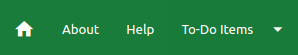
So let's give it a go, shall we? Feel free to look through the Icons page's list of entries and add it in wherever you wish, however in this example we will replace the Home link in the navbar with an appropriate icon.
First we need to find the entry on the Icons page and make note of its name (displayed below it), which is conveniently called home in this case.
Now let's find the Home Page link in our navigation partial and expand the link_to helper into a block so that we can place the icon into it via an
<i> tag - /app/views/layouts/_navigation.html.erb:
        <li>
          <%= link_to root_path do %>
            <i class="material-icons">home</i>
          <% end %>
        </li>
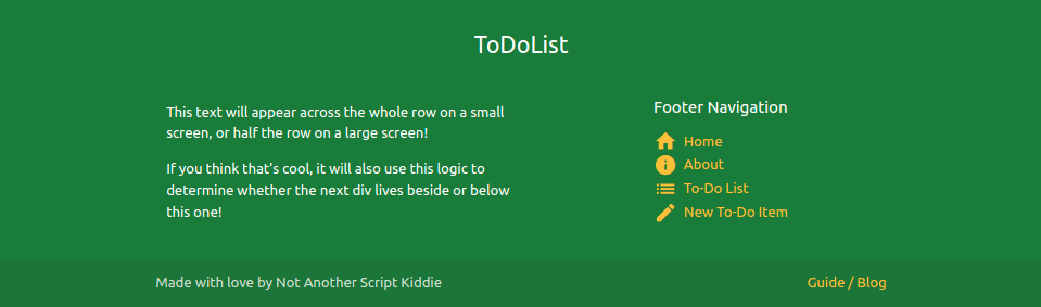
Let's use this same method to add icons to our footer links as well, just to give it a bit of extra pizzazz - /app/views/layouts/_footer.html.erb:
<h6>Footer Navigation</h6>
<ul>
<li><%= link_to root_path do %><i class="material-icons inline">home</i> Home<% end %></li>
<li><%= link_to about_path do %><i class="material-icons inline">info</i> About<% end %></li>
<li><%= link_to todos_path do %><i class="material-icons inline">list</i> To-Do List<% end %></li>
<li><%= link_to new_todo_path do %><i class="material-icons inline">create</i> New To-Do Item<% end %></li>
</ul>
Despite adding it above, the inline class of the <i> element doesn't exist yet, but we will create it to get around the alignment issue.
Let's add it to the bottom of our stylesheet and use it to align our icons with the text
- /app/javascript/styles/styles.scss
i.inline {
  vertical-align: middle;
}
As a final touch, we'll use the same icons for the To-Do List and New To-Do item in the drop-down menu to tie it all together.
Heading back into the navigation partial, we'll quickly replace the existing entries with similar <li> elements to those above,
though we will do away with the inline class on the icons and instead put them on separate lines - /app/views/layouts/_navigation.html.erb:
    <li><%= link_to todos_path do %><i class="material-icons">list</i><br />To-Do List<% end %></li>
    <li class="divider"></li>
    <li><%= link_to new_todo_path do %><i class="material-icons">create</i><br />New To-Do item<% end %></li>
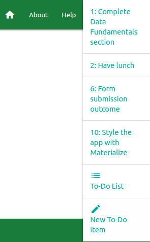
With the power of icons now available to us, let's make our app a bit more contemporary and mobile-user friendly by adding a side navigation. There are a few areas that cover this on the Materialize site (Navbar & Sidenav) and here we'll amalgamate the two, and work around a minor issue with it, to provide a good mobile user experience!
In Materialize, the side navigations work using the sidenav class of unordered lists (<ul>).
Much like the drop-down list in our main navigation bar, our sidenav will open via a link that points to such an unordered list.
Let's open our navigation partial and add the list of options we want in our sidenav, each with their own icon because we can do that now, as well as a nice title
- we'll position this below below our existing list but above the <nav> block - /app/views/layouts/_navigation.html.erb:
<ul id="mobile-nav" class="sidenav">
<li><h3 class="center"> ToDoList </h3></li>
<li><%= link_to root_path do %><i class="material-icons inline">home</i> Home<% end %></li>
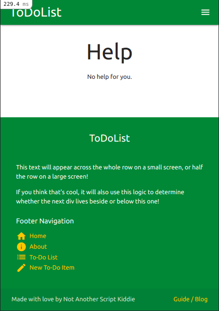
<li><%= link_to about_path do %><i class="material-icons inline">info</i> About<% end %></li>
<li><%= link_to help_path do %><i class="material-icons inline">help</i> Help<% end %></li>
<li><%= link_to todos_path do %><i class="material-icons inline">list</i> To-Do List<% end %></li>
<li><%= link_to new_todo_path do %><i class="material-icons inline">create</i> New To-Do Item<% end %></li>
</ul>menu icon!
We'll insert this
sidenav-trigger below the logo line in the <nav> block:
<a class="sidenav-trigger right" href="#!" data-target="mobile-nav"><i class="material-icons">menu</i></a>Let's replace the
<ul class="right"> element below the line we just edited with:
<ul class="right hide-on-med-and-down">
Clicking the icon reveals our lovely sidenav bar on the left!

Pretty neat, right?
Well, remember the "minor issue" mentioned above? If you select a link from your sidenav, and then try to open it again, we sadly see that the sidenav fails to open (at least until we actively refresh
the page). This is similar to what we saw with the primary navigation drop-down, however this isn't solvable by auto-initialising the JavaScript under different criteria.
However, the way to fix this is very simple! The Sidenav shows us how we can open the plugin instance manually with a simple
bit of JavaScript, which we can simply insert into our navigation partial to ensure it works every time!
We'll start by creating a quick JS function in a <script> block to identify and open the sidenav - we'll put this below the <nav> block:
  <script>
    function openSideNav() {
      var instance = M.Sidenav.getInstance(document.querySelector('.sidenav'));
      instance.open();
    }
</script>onclick attribute to our sidenav-trigger to activate this - when complete, our entire _navigation.html.erb partial
should look something like this:
<header>
  <!-- Desktop Navigation Dropdown -->
  <ul id="nav-dropdown" class="dropdown-content">
    <% Todo.all[0..4].each do |todo| %>
      <li><%= link_to "#{todo.id}: #{truncate(todo.name, length: 40)}", todo_path(todo) %></li>
      <li class="divider"></li>
    <% end %>
    <li><%= link_to todos_path do %><i class="material-icons">list</i><br />To-Do List<% end %></li>
    <li class="divider"></li>
    <li><%= link_to new_todo_path do %><i class="material-icons">create</i><br />New To-Do item<% end %></li>
  </ul>
  <!-- Mobile Navigation Sidenav -->
  <ul id="mobile-nav" class="sidenav">
    <li><h3 class="center"> ToDoList </h3></li>
    <li><%= link_to root_path do %><i class="material-icons inline">home</i> Home<% end %></li>
    <li><%= link_to about_path do %><i class="material-icons inline">info</i> About<% end %></li>
    <li><%= link_to help_path do %><i class="material-icons inline">help</i> Help<% end %></li>
    <li><%= link_to todos_path do %><i class="material-icons inline">list</i> To-Do List<% end %></li>
    <li><%= link_to new_todo_path do %><i class="material-icons inline">create</i> New To-Do Item<% end %></li>
  </ul>
  <!-- Primary Navigation Bar -->
  <nav>
    <div class="nav-wrapper">
      <%= link_to root_path, class: 'brand-logo left' do %>  ToDoList<% end %>
      <!-- Mobile Sidenav Trigger -->
      <a class="sidenav-trigger right" data-target="mobile-nav" onclick="openSideNav();"><i class="material-icons">menu</i></a>
      <ul class="right hide-on-med-and-down">
        <li>
          <%= link_to root_path do %>
            <i class="material-icons">home</i>
          <% end %>
        </li>
        <li><%= link_to 'About', about_path %></li>
        <li><%= link_to 'Help', help_path %></li>
        <!-- Desktop Dropdown Trigger -->
        <li>
          <a class="dropdown-trigger" href="#!" data-target="nav-dropdown">
            To-Do Items <i class="material-icons right">arrow_drop_down</i>
          </a>
        </li>
      </ul>
    </div>
  </nav>
  <!-- ensure Sidenav Trigger works -->
  <script>
    function openSideNav() {
      var instance = M.Sidenav.getInstance(document.querySelector('.sidenav'));
      instance.open();
    }
  </script>
</header>
This is essentially the long and short of it. However Materialize allows one to do many things to and/or with these icons,
normally with something as simple as a class attribute in the <i> tag, including:
- Change the size of the icons
- Prefix form fields with icons
- Add icons to buttons, or make a button that only shows an icon
$ git add -A
$ git commit -m "Set colour var + icons and made nav mobile-friendly"
$ git push origin materialize
| < [ToDoList] Materialize I: Basic Layout | | | [ToDoList] Materialize III: Forms> |
| Back | ||

Comments
Post a Comment