[ToDoList] Materialize III: Forms
We've covered most of the basics of Materialize-ifying (don't know why I turned a verb into a verb, even if it is technically a noun in this instance) our app, but have so far neglected a fairly crucial aspect:
forms.
The form is naturally a very important element of a Rails (or, indeed, any data-driven) application, and it is therefore pretty important that we learn how to utilise Materialize to make them as nice as possible to use.
As you can possibly tell already, they gave me a little bit of trouble. However I wouldn't be a very good unqualified instructor if I didn't cover them and so, through tears and cursing, the following section has been prepared to cover the adaption of the Rails form to work with Materialize, as well as:
- Buttons for links / forms
- Form text fields with character counters
- Display error messages in a card
- Display flash messages in a toast
Because it will be the first view that new users experience, we will start by building up our new view and its form partial in Materialize style,
before moving onto the other elements of form submission (confirmation / error messages, etc).
When these are complete, we'll use what we've learned to show the other form-clad view, edit, some similar love.
So, to begin with, we will deal with the contents of the new view file. Currently we simply have a heading, a reference to the form partial
and a cancel link back to the index. We won't do too much to this file: simply put the whole view in a container; set each section of the page into its own row;
and replace the link to cancel with a charming button that has a tooltip.
So without further ado, let's head into /app/views/todos/new.html.erb:
<div class="container">
  <div class="row">
    <h3>New To-Do item</h3>
  </div>
  <div class="row">
    <%= render 'form' %>
  </div>
  <div class="row">
    <div class="col s12 m8 center-align">
      <%= link_to todos_path,
                     class: 'btn-floating btn-large waves-effect waves-light red tooltipped',
                     :"data-tooltip" => 'Cancel',
                     :"data-position" => 'bottom' do %>
        <i class="material-icons">close</i>
      <% end %>
    </div>
  </div>
</div>col div (with a center-align class) to the row containing the button as we will want it to align with the form.
Specifying 12 columns for small windows and 8 for medium and higher will ensure that this looks good on whatever device it is accessed on,
as long as we make the form column divs s12 m8 as well when we edit the partial.
In the sections above this where we only added row divs, this will default to spanning the length of the row and aligning to the left, which is fine.
The other bit to notice is how we set up the cancel button. This uses the options for floating button links from the
Buttons page of the Materialize site,
as well as Tooltips.
These have been added to the Rails link helper using various attributes (e.g. class) in the helper itself.
We have then expanded the helper to a block and nested the syntax for the close icon within it.
A crucial thing to notice is the syntax of the data-tooltip and data-position attribute arguments for the link_to helper
- unlike the class attribute, these need to be passed as symbols as they are not natively supported by the helper.
Unfortunately though, symbol notation in Ruby cannot feature hyphens (-).
In order for these symbols to parse correctly, we therefore need to surround everything after the colon (:) in quotation marks (").
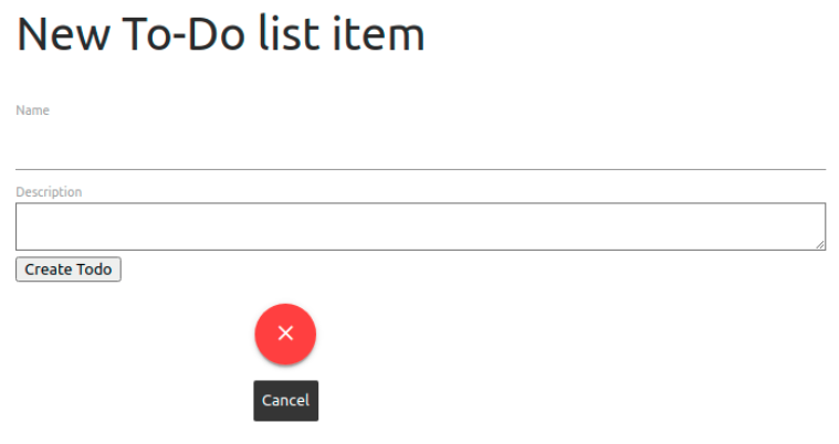
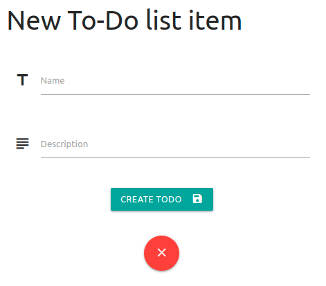
In any case, with this done we can navigate the the new view URL in our browser window to check out the changes we have made:
Now let's move onto the form itself. Our form partial also contains the code for the error message display, but we'll ignore this for now and just concentrate on the form code. Both of our form inputs are of the text persuasion, so we can consult the Form Text Inputs Materialize page to get the components & templates available to us in order to beautify our form, and make them fit the Rails form format where possible.
(The word "form" has already lost all meaning, and we're only one section in...).
In this example, I have decided that I would like my text fields to have icon prefixes as well as character counters and associated in-view validation.
A fancier submit button might do nicely as well!
To do so, I will carry out the following steps against the existing new view:
- Place each text field (& the submit button) into their own row divs.
- Span the child divs over 12 small or 8 medium+ columns.
- Prefix the text input fields with appropriate icons.
- Reorganise the text field labels to conform to Materialize's requirements, adding necessary classes if required.
- Add the
validateclass and corresponding attributes to the fields in order to indicate if a required field is empty. - Add
data-lengthattributes to the Rails form text inputs in order to implement the character counter and supplement validation. - Replace the default
submitbutton with a snazzy Materialize one with the same value text.
There are two complications with the character counter.
Firstly, there no is baked-in way to retrieve the length validations from our Todo model, which we will need to determine the counter's maximum length
(and likewise for presence validation).
The closest we have is calling _validators from the model object, but this only returns an array of the available validators for each field:
> x = Todo.new
> x._validators
=> {:name=>[#<ActiveRecord::Validations::PresenceValidator:0x00005647afff8488 @attributes=[:name], @options={}>, #<ActiveRecord::Validations::LengthValidator:0x00005647af69f878 @attributes=[:name], @options={:maximum=>200}>]}We could just hard-code the value in, but that that is fairly short-sighted and would mean updating it every time we updated the validation in the model. We're better than that.
The second complication is slightly less problematic - similarly to the issues we had with the dropdown and sidenav in earlier sections,
an oversight / bug in Materialize v1.0.0's JavaScript AutoInit fails to actually activate the required function in order to display the counters
(which kinda sucks - at least the nav components worked in the first instance).
Because I like you so much, I have minimised the pain of working around both of these complications by subjecting only myself to it (:microscopic-violin-emoji:), and we can mitigate these issues by doing the following:
-
Create a method in our
Todomodel to fetch the validation length, which we can then call in the view to populate thedata-lengthvalue. - Explictly call the required JavaScript function against the appropriate page elements in our
scriptspartial in order to make the counters actually... count.
So, starting with the validation length fetch, we can use the return of the _validators method (as shown above) to fetch the desired value by
filtering out the bits we don't need. In this case, to retrieve the maximum length of the name field, we can:
> xvals = x._validators[:name].select { |e| e.is_a? ActiveRecord::Validations::LengthValidator }
=> [#<ActiveRecord::Validations::LengthValidator:0x000055d8ff69f9f0 @attributes=[:name], @options={:maximum=>200}>]
> xvals.first.options[:maximum]
=> 200
Let's do this in our model, below the validates line(s) - /app/models/todo.rb:
  def required_field?(field)  ## pass field i.e. :name
    presence_validators = validators(field, ActiveRecord::Validations::PresenceValidator)
    !presence_validators.empty?
  end

  def length_val(field, minmax)  ## pass field name and which value i.e. :name, :maximum)
    length_validators = validators(field, ActiveRecord::Validations::LengthValidator)
    return nil if length_validators.empty?
    length_validators.first.options[minmax]
  end

  private
  def validators(field, val_class)  ## pass field name and the validator class to check
    _validators[field].select do |e|
      e.is_a? val_class
    end
endTodo object:
> reload!                               ## reload the console to bring in our changes
> Todo.new.required_field?(:name)       ## see if name field is required
=> true
> Todo.new.length_val(:name, :maximum)  ## fetch maximum length for name field
=> 200
With that done we can move onto the second issue and deal with AutoInit failing to insert the character counters.
All we need to do here is use JavaScript to collect the elements with a data-length attribute using querySelectorAll(),
and pass the resulting array to the Materialize function that initialises the character counter (M.CharacterCounter.init()).
Then we can use another Materialize function to update the form text fields (M.updateTextFields()).
We'll insert the code to do this into our scripts partial beneath the M.AutoInit(); line in each block
- our /app/views/layouts/_scripts.html.erb should therefore look like:
<script>
  document.addEventListener('DOMContentLoaded', function() {
    M.AutoInit();
    M.CharacterCounter.init(document.querySelectorAll('[data-length]'));
    M.updateTextFields();  // this also works around an issue with labels overlapping values
  });
  if (document.readyState!='loading') {
    M.AutoInit();
    M.CharacterCounter.init(document.querySelectorAll('[data-length]'));
    M.updateTextFields();
  };
</script>Let's save ourselves a refactoring step later on and stick these lines in their own function:
  function initToDoList() {
    M.AutoInit();
    M.CharacterCounter.init(document.querySelectorAll('[data-length]'));
    M.updateTextFields();  // this also works around an issue with labels overlapping values
};_scripts.html.erb should now look like:
<script>
  document.addEventListener('DOMContentLoaded', function() {
    initToDoList();
  });

  if (document.readyState!='loading') {
    initToDoList();
  };

  function initToDoList() {
    M.AutoInit();
    M.CharacterCounter.init(document.querySelectorAll('[data-length]'));
    M.updateTextFields();  // this also works around an issue with labels overlapping values
  };
</script>
Materialize specifies divs for text inputs with the input-field class, which activates the lovely CSS that we expect from such a framework.
We will nest this div in a row and give it the same size we specified in the new view: s12 m8.
Inside this div we will add our icon prefix (with prefix class) first,
and then our existing Rails form elements, with the label sitting at the bottom as specified by the framework.
For the actual text_field Rails form element, we will add the validate class to highlight when improper values have been entered into our form fields before
the values are submitted.
"How?" you ask?
"Why," I respond with needlessly exaggerated enthusiasm, "by making use of the methods we wrote in the model earlier!"
We can pass our presence validator method to the required & aria-required attributes
to highlight if an empty field should not be so, and our length validator method to a data-length attribute to highlight when too few or too many characters have been entered (as well as activate
our character counters).
With all this in mind, we will change our first form block (for the name field) to the following in /app/views/todos/_form.html.erb:
<%= form_with model: @todo, local: true do |td_form| %>

  <div class="row">
    <div class="input-field col s12 m8">
      <i class="material-icons prefix">title</i>
      <%= td_form.text_field :name,
                             class: 'validate',
                             required: @todo.required_field?(:name),
                             :"aria-required" => @todo.required_field?(:name),
                             :"data-length" => @todo.length_val(:name, :maximum) %>
      <%= td_form.label      :name %>
    </div>
</div>Once again, we have attributes that must be passed as a symbol but contain a hyphen which we've had to enclose in quotation marks in the helper argument.
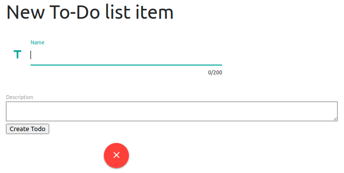
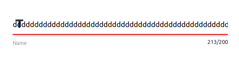
If we refresh our browser page and click inside the name field, we will see the fruits of our labours!
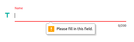
And a quick attempt at submitting a blank form will show us that at least part of our validation is working perfectly!
With our first form field complete, we can move onto the second one: the description.
This will largely be in an identical format to what we have just written for the name field, but with a few small changes:
- The icon we select.
- We will be using a different helper for the field as the description is longer (
text_area). - Because we are using a
text_area, the Materialize page tells us to use thematerialize-textareaclass with it. - The field argument we pass to our helpers & custom model methods.
  <div class="row">
    <div class="input-field col s12 m8">
      <i class="material-icons prefix">subject</i>
      <%= td_form.text_area :description,
                            class: 'materialize-textarea validate',
                            required: @todo.required_field?(:description),
                            :"aria-required" => @todo.required_field?(:description),
                            :"data-length" => @todo.length_val(:description, :maximum) %>
      <%= td_form.label     :description %>
    </div>
</div>data-length attributes here even though we don't have any validation set up for the
description field. I have personally done this so that, if we do decide to introduce a validation for the field later, we don't have to do anything other than amend the model.
This won't cause any issues with our app because of how we set up the methods - in particular, the length_val method returns nil if
there were no validators to check, and Rails is clever enough to omit the field from the final render if the value is nil!
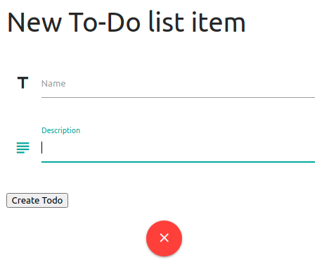
Refreshing our browser pages give us our lovely updated form:
Let's move onto the final edit of the form itself and snazz up the submit button. Because this is an entirely different element, we will need the take the following into consideration:
- We will not need the
input-fieldclass on the row's child div because the field isn't accepting text input. -
In order to align it with the form, and the cancel button we set up earlier, we will give the div the same
s12 m8column width as well as thecenter-alignclass. -
To allow more control over the field's content, we will be swapping the
submithelper for abuttonhelper.- Unfortunate this helper does not native ability accept the
classattribute as an argument, so this time we will need need to pass this as a symbol. - The helper can, however, be used as a block, which we can use to specify the text (retrieved from the
submithelper) and add an icon.
- Unfortunate this helper does not native ability accept the
  <div class="row">
    <div class="col s12 m8 center-align">
      <%= td_form.button :class => 'btn waves-effect waves-light' do %>  <!-- use btn-large for bigger button -->
        <%= td_form.send(:submit_default_value) %>  <!-- Fetch what submit helper would have shown -->
        <i class="material-icons right">save</i>
      <% end %>
    </div>
  </div>

<% end %> <!-- end the Rails form block -->submit button would have used,
mainly because it was an absolute bitch to find and I want some pity for that (:subatomic-violin-emoji:).
Also, as detailed in the comments, if you would prefer a bigger submit button this can be easily done by swapping the btn class for btn-large.
In addition, this button will take the colour of your $secondary-color variable by default - this, again, is easily swapped by adding the color variable name into the class list
in the helper. A similar approach can be taken if you'd like to change the colour of the Wave effect when the button is pressed.
e.g.
:class => 'btn-large green waves-effect waves-blue'
So we've got the form looking as sexy as it can, and it actually still works! However there is a fairly pressing issue that significantly affects the form aesthetics.
I'm not talking here about our error message or confirmation messages display, though this does need some improvement, but an issue occurs that occurs because of something
that Rails does in order to try and help us!
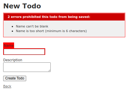
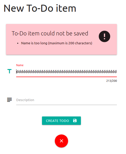
If we try to submit an invalid To-Do item that isn't prevented from submitting by Materialize's validation (i.e. we try to submit a name with more than 200 characters), we see that the icon prefixes for the input fields with errors have ended up inside the field itself and the label has gone walkabout to the bottom of the field:
The issue here is down to the fact that, when a form returns with an error, Rails will (rather cleverly) place the field in a div sporting the field_with_errors class.
In fact, if you create an app with the scaffold generator and add validation to the model, this will generate CSS that automatically highlights these fields:
With this kind of cunning ability that Rails gives us, it would be a shame to waste it.
Should you wish to do so in your app (which is probably the easier option), we can we can tell Rails not to add these divs by
adding the following line to the bottom of /config/environment.rb:
ActionView::Base.field_error_proc = Proc.new do |html_tag, instance|
  html_tag.html_safe
endfield_with_errors divs and instead apply this class to the parent divs of each and move the content here (before removing the original, now empty, divs).
The do this, our JavaScript process will need to:
- Find the parent div (in this case the
input-fielddiv). - Extract all of the chlld elements within the parent and filter out the
field_with_errorsdivs. - Rebuild the parent (i.e.
input-field) div with the extracted elements and apply thefield_with_errorsclass to it.
<script> block in our scripts partial,
and then search for the affected divs and run the functions from the event listener block at the top (not the readyState block, though).
When complete, our
/app/views/layouts/_scripts.html.erb partial will look like:
<script>
  document.addEventListener('DOMContentLoaded', function() {
    initToDoList();
    Array.from(document.getElementsByClassName('field_with_errors')).forEach(fixErrorDiv);  // call function
  });

  if (document.readyState!='loading') {
    initToDoList();
  };

  function initToDoList() {
    M.AutoInit();
    M.CharacterCounter.init(document.querySelectorAll('[data-length]'));
    M.updateTextFields();  // this also works around an issue with labels overlapping values
  };

  function fixErrorDiv(elem) {
    if(elem.childElementCount === 0 || elem.firstElementChild.localName === 'label') {
      return;  // skip label divs or divs already done
    };
    var parElem = elem.parentElement;  // find the input-field div
    var elems = Array.from(parElem.children).map(extractErrDivContent).flat();  // grab everything in it
    parElem.classList.add('field_with_errors');  // add required class to input-field div
    parElem.replaceChildren();  // remove everything in input-field div
    for (let i in elems) { parElem.append(elems[i]) };  // put everything in the new div
  };

  function extractErrDivContent(errDiv) {
    if(errDiv.className === 'field_with_errors') {
      return Array.from(errDiv.children);  // extract contents of field_with_errors div
    } else {
      return errDiv
    };
  };
</script>
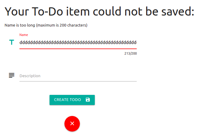
With that... "interesting" (read: infuriating) issue corrected, we can move onto the other issue with our new and beautify our errors message display.
After hunting through the various Materialize components that might be applicable here, I have decided that this example will use a Card to display these errors at the top of the page. This not only beautifies it slightly, but ensures that the messages remain on the page so the user can consult them at their leisure when editing their input.
I will just use a Basic Card from the example on the Materialize site and adapt it for my needs, and throw in an icon there for good measure. However, as you will see if you visit the page, there is a lot of variety that one can get out of a card, so feel free to be creative with yours!
We will keep the logic in place that only displays the errors if the object we pass in the @todo instance variable contains any,
and replace everything in that block with the syntax we need to turn it into a card (keeping all of this above the form code we've just been working on)
- /app/views/todos/_form.html.erb:
<% if @todo.errors.any? %>
  <div class="row">
    <div class="col s12 m8 xl5">         <!-- reduce the size on further on larger screens -->
      <div class="card red lighten-4">   <!-- add a colour to the class to fill it (default is white) -->
        <div class="card-content">
          <i class="material-icons medium right">error</i>
          <span class="card-title">To-Do item could not be saved</span>
          <p>
            <ul class="browser-default">
              <% @todo.errors.full_messages.each do |msg| %>
                <li><%= msg %></li>
              <% end %>
            </ul>
          </p>
        </div>
      </div>
    </div>
  </div>
<% end %>You know the drill: refresh browser, submit invalid form entry, gaze upon beauty.
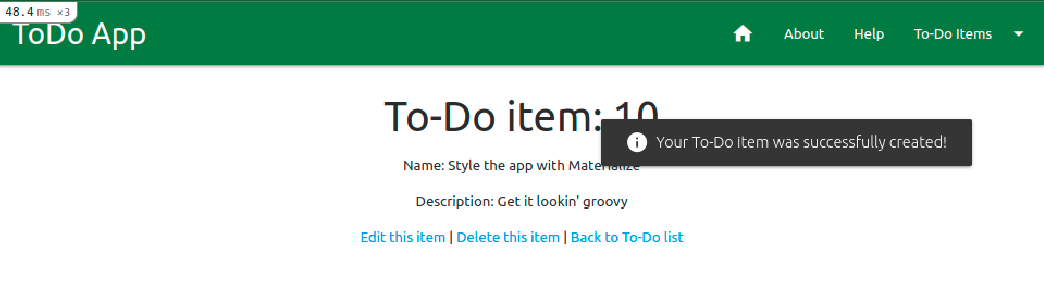
Now we approach our final activity with the forms part of this Materialize section guide, and it will just make the web app that much sweeter. I am talking, of course, about the confirmation messages.
Unlike the error message, there is no need to keep the confirmation message on the screen for longer than a couple of seconds. Searching the Materialize site, there are a couple of options that would handle this in different ways - in this example, we will harness the power of Toasts to convey our joyful messages!
You may remember that, unlike the error messages, we handle success messages and notifications via Rails' flash system,
for which we gave them their own partial and displayed them as a list above the yield of the page.
Using toasts, which provide a separate on-page notification for each message, we can dispense with the list and just pass each of the flash messages to the function.
That means, for the first time in this entire section, we are using fewer lines of code than we did before!
All we need to do is call the M.toast JavaScript function that is built into Materialize and pass it the message we want to display, doing this for each message.
And, because we want it to look as good as it can, let's throw an icon in there for good measure!
Let's replace the list items with toasts so that our messages partial looks as follows - /app/views/layouts/_messages.html.erb:
<% flash.each do |k, msg| %>
<script>M.toast({html: "<i class='material-icons'>info</i> <%= msg.to_s %>"})</script>
<% end %>
Remember in the last section I teased you with the idea that we were on the final section? Well... I might have exaggerated a bit.
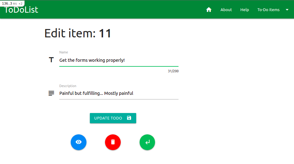
This is the last bit (I promise), and all we'll do is tidy up the edit view that also displays the form!
Luckily we can mostly copy what we've done for the new view, but we'll need some slight changes - obviously we need the page heading from our original version of the view,
but we'll also need to rethink the cancel button. On our original version of the view, we had links back to the item's show view, one to delete the item
and a link back to the index.
Let's go a bit crazy and create buttons for each of these, with tooltips!
While the page heading we can just edit to reflect the view's purpose, the buttons aren't quite so simple - some alignment is going to be necessary in order for the page to look right, especially with the different widths we have for small (mobile) and medium+ (tablet / desktop) browser windows.
Once again, though, I have done the painful tweaking of column widths and offsets to get them looking aligned beautifully so you don't have to!
Let's head into our edit view and get it updated - /app/views/todos/edit.html.erb:
<div class="container">
  <div class="row">
    <h3>Edit item: <strong><%= @todo.id.to_s %></strong></h3>
  </div>
  <div class="row">
    <%= render 'form' %>
  </div>
  <div class="row">
    <div class="col s4 m2 xl1 offset-m1 offset-xl2 center">
      <%= link_to todo_path(@todo),
                  class: 'btn-floating btn-large waves-effect blue tooltipped center',
                  :"data-tooltip" => 'Back to To-Do Item',
                  :"data-position" => 'bottom' do %>
        <i class="material-icons">visibility</i>
      <% end %>
    </div>
    <div class="col s4 m2 center">
      <%= link_to todo_path(@todo),
                  method: :delete,
                  data: { confirm: 'Are you sure?' },
                  class: 'btn-floating btn-large waves-effect red tooltipped center',
                  :"data-tooltip" => 'Delete To-Do Item',
                  :"data-position" => 'bottom' do %>
        <i class="material-icons">delete</i>
      <% end %>
    </div>
    <div class="col s4 m2 xl1 center">
      <%= link_to todos_path,
                  class: 'btn-floating btn-large waves-effect green tooltipped center',
                  :"data-tooltip" => 'Back to To-Do List',
                  :"data-position" => 'bottom' do %>
        <i class="material-icons">subdirectory_arrow_left</i>
      <% end %>
    </div>
  </div>
</div>xl width in the center button is intentional, and rather essential for correct alignment.
If we go back into our browser and head to an edit URL, we can see that these buttons and their tooltips work perfectly, and align charmingly no matter how wide the browser window!
Wow, that was intense, huh? Well take a good rest and a strong drink - you definitely deserve it! At least you have a gorgeous new form to show for you brain explosion, which I'll just give a little hint to push to GitHub before we move on!
$ git add -A
$ git commit -m "Form modal revamp incl. confirmation and errors"
$ git push origin materialize
| < [ToDoList] Materialize II: Colour & Icons | | | [ToDoList] Materialize IV: Other Views> |
| Back | ||

Comments
Post a Comment