[ToDoList] Materialize IV: Other Views
With the last section being fairly intense, you'll be pleased to know (I hope) that the remaining todo views aren't nearly as complicated and have a bit more
freedom with regards to creativity when building them.
We'll spend some time sprucing up the index and show views to conform to our fancy new standard, and try to have a bit of fun with it.
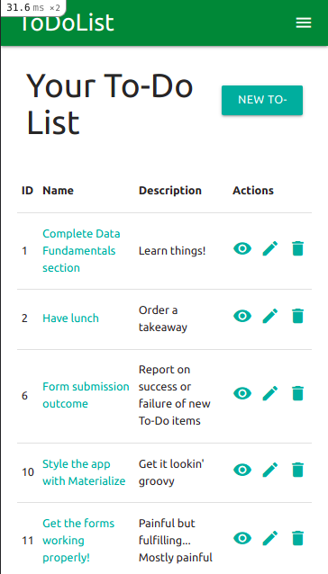
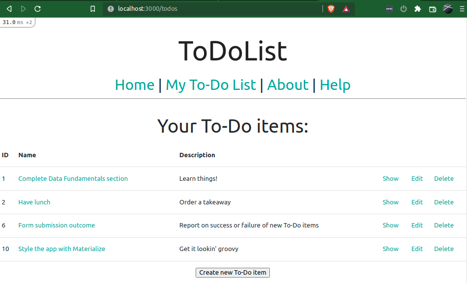
Starting with the index view, we'll naturally want to keep it fairly basic - showing the name and possibly the description, as well as
the same [C]RUD actions we had already in our current index view.
There are numerous options available to us to present these features:
- We could go mega-fancy and do a Kanban-esque board of cards, with their actions contained somewhere within.
- We could go ultra-contemporary and still use cards, but simply list each item.
- We could go sleek with all of the show views displaying under tabs.
- Or we can just stick with a fairly basic table option.
There are a couple of funky options that Materialize gives us in terms of tables, including responsive tables that will
flip the axes if the browser window falls below a certain width (i.e. mobile browsers) as well as functionality to highlight the selected row.
To fulfill my vision, I am going to leave the axes alone but add the highlight functionality, and then replace the action links with tooltipped icons.
For absolute ease of use, I'm also going to add a button to create a new To-Do list item at the top of this page.
So, let's get started! There shouldn't be a huge change to the general structure of our original index view - just adding in the containers and the buttons!
Heading into /app/views/todos/index.html.erb:
<div class="container">
  <div class="row valign-wrapper">
    <div class="col s8">
      <h3 class="header">Your To-Do List</h3>
    </div>
    <div class="col s4">
      <%= link_to 'New To-Do Item', new_todo_path, class: 'btn waves-effect waves-light right' %>
    </div>
  </div>
  <div class="row">
    <table class="highlight">
      <thead>
        <tr>
          <th>ID</th>
          <th>Name</th>
          <th>Description</th>
          <th colspan="3">Actions</th>
        </tr>
      </thead>

      <tbody>
        <% @todos.each do |todo| %>
          <tr>
            <td><%= todo.id.to_s %></td>
            <td><%= link_to todo.name, todo_path(todo) %></td>
            <td><%= truncate(todo.description, length: 100) %></td>
            <td>
              <%= link_to todo_path(todo),
                          :class => 'tooltipped',
                          :"data-tooltip" => 'Show To-Do Item',
                          :"data-position" => 'bottom' do %>
                <i class="material-icons">visibility</i>
              <% end %>
            </td>
            <td>
              <%= link_to edit_todo_path(todo),
                          :class => 'tooltipped',
                          :"data-tooltip" => 'Edit To-Do Item',
                          :"data-position" => 'bottom' do %>
                <i class="material-icons">edit</i>
              <% end %>
            </td>
            <td>
              <%=
                link_to todo_path(todo),
                        method: :delete,
                        data: { confirm: 'Are you sure?' },
                        :class => 'tooltipped',
                        :"data-tooltip" => 'Delete To-Do Item',
                        :"data-position" => 'bottom' do %>
                <i class="material-icons">delete</i>
              <% end %>
            </td>
          </tr>
        <% end %>
      </tbody>
    </table>
  </div>
</div>- We've aligned the button to create a new item with the heading using a
valign-wrapperclass on therowdiv that contains them. - The
highlightclass was added to the<table>element to give it the functionality we want. - We've replaced the text previously showing the action links with icons, but not buttons, in order to fit them nicely in the table.
- Our trusty Rails helper
truncatehas been dusted off to limit the description to 100 characters.

Oh, but were it so simple...
If we reduce the width of our browser window to mobile size, we can see how horrific this will look to poor mobile users:
Not only is the button for new items truncated and squashing the page heading, but the table itself is awfully squished and unseemly. Believe me, no amount of playing with column widths is saving this (especially if we want the top button and the heading vertically aligned!)
However, we've been doing this guide for over 20 sections now - I'm sure we can come up with a solution. And we can.
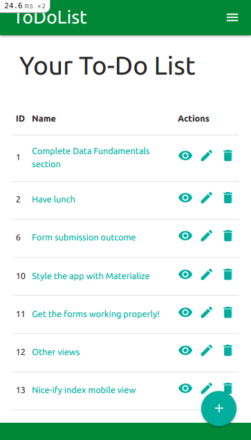
Perusing the Materialize site, we come across the functionality for floating action buttons which, as we've used mobile devices before, we know will add a persistent button in the bottom corner of our view - this is a prime solution to our mobile-user problem, especially given that Materialize already provides helpers to hide elements in certain browser window widths!
So let's add one of these floating action buttons to the small views to replace our create button at the top, and use the helpers and column widths
to help us hide the ones that aren't needed - we'll replace our first row div block with:
  <div class="row valign-wrapper">
    <div class="col s12 m8">
      <h3 class="header">Your To-Do List</h3>
    </div>
    <div class="col m4 hide-on-small-only">
      <%= link_to 'New To-Do Item', new_todo_path, class: 'btn waves-effect waves-light right' %>
    </div>
    <div class="fixed-action-btn hide-on-med-and-up">
      <%= link_to new_todo_path,
                  class: 'btn-floating btn-large waves-effect waves-light tooltipped',
                  :"data-tooltip" => 'New To-Do Item',
                  :"data-position" => 'left 'do %>
        <i class="material-icons">add</i>
      <% end %>
    </div>
</div>As a final thought, let's also add the same hide helper for the description table header:
<th class="hide-on-small-only">Description</th> <td class="hide-on-small-only"><%= truncate(todo.description, length: 100) %></td>
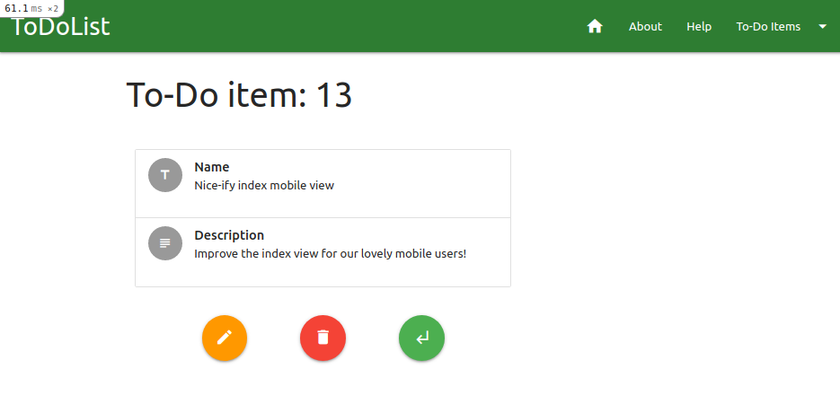
With our index complete, there remains only one action view remaining to beautify - our show view.
Again, I'm going to stay with the "simpler is better" mantra and, out of the many options that Materialize gives us for this sort of thing, am going to opt for displaying the Todo
values in a collection (though will obviously go with a little flair and add some icons).
Aside from the values themselves, we will need a similar set of button links as the edit view so that we can navigate effectively to other actions.
Given this, we may as well copy the HTML for our edit view and use it as a basis to build from - all we need to do differently is:
- Change the page heading to reflect the view's purpose.
- Substitute the form's
renderelement for the collection containing theTodoobject values. - Swap the
showview button for one that links to theeditview.
The page heading is simple, as we can simply preserve the value from the existing show view and pop it into the <h3> block from our copied edit view HTML.
We can largely apply this same logic to the Todo object value collections as well, copying the HTML from the
avatar content collection example, removing the bits we don't want and subtituting in the values for our object
as with our current show view.
And all we need to do to the link buttons is change the show button's link helper, icon and tooltip to get it to point to the correct view.
We'll even change the colour so that there is some consistency of this amongst our action buttons!
So, with all this in mind, we'll set about making the view as glamourous as the others - /app/views/todos/show.html.erb:
<% content_for(:html_title) { @todo.name } %>
<div class="container">
  <div class="row">
    <h3 class="header">To-Do item: <%= @todo.id.to_s %></h3>
  </div>
  <div class="row">
    <div class="col s12 m8">
      <ul class="collection">
        <li class="collection-item avatar">
          <i class="material-icons circle">title</i>
          <span class="title"><strong>Name</strong></span>
          <p><%= @todo.name.to_s %></p>
        </li>
        <li class="collection-item avatar">
          <i class="material-icons circle">subject</i>
          <span class="title"><strong>Description</strong></span>
          <p><%= @todo.description.to_s %></p>
        </li>
      </ul>
    </div>
  </div>
  <div class="row">
    <div class="col s4 m2 xl1 offset-m1 offset-xl2 center">
      <%= link_to edit_todo_path(@todo),
                  class: 'btn-floating btn-large waves-effect orange tooltipped center',
                  :"data-tooltip" => 'Edit To-Do Item',
                  :"data-position" => 'bottom' do %>
        <i class="material-icons">create</i>
      <% end %>
    </div>
    <div class="col s4 m2 center">
      <%= link_to todo_path(@todo),
                  method: :delete,
                  data: { confirm: 'Are you sure?' },
                  class: 'btn-floating btn-large waves-effect red tooltipped center',
                  :"data-tooltip" => 'Delete To-Do Item',
                  :"data-position" => 'bottom' do %>
        <i class="material-icons">delete</i>
      <% end %>
    </div>
    <div class="col s4 m2 xl1 center">
      <%= link_to todos_path,
                  class: 'btn-floating btn-large waves-effect green tooltipped center',
                  :"data-tooltip" => 'Back to To-Do List',
                  :"data-position" => 'bottom' do %>
        <i class="material-icons">subdirectory_arrow_left</i>
      <% end %>
    </div>
  </div>
</div>
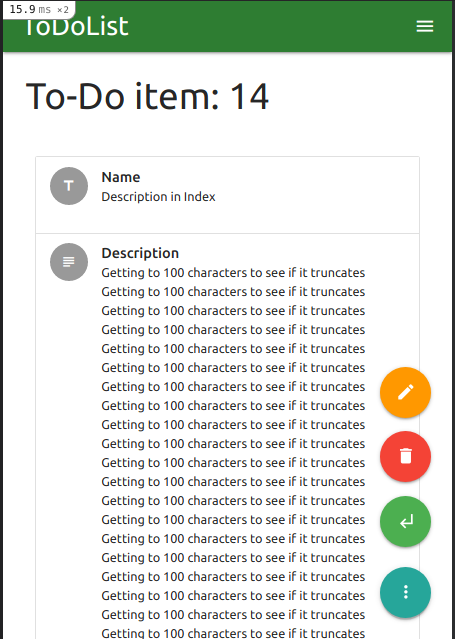
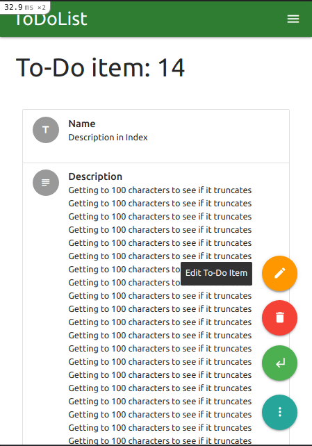
But, of course, there's a slight problem - and I bet you know what it is!
Switching to a mobile view width, we can see that the action buttons aren't visible if the description is too large - we have to actively scroll down to reach them:

Now, obviously, this isn't the end of the world. However it also isn't ideal, and little details like these will put users (especially new ones) at a disadvantage.
It didn't matter so much with the edit view, because that page has a general flow to it where one will naturally scroll to the bottom while working one's way through the form.
But on a show view, where people might only be accessing the view to check something and then edit / delete it, we need to be a bit more accommodating.
Luckily, we've already explored the best means to circumvent this issue already in this section - our friendly neighbourhood floating action button!
Our usage of it above largely stripped out its secondary functionality, which is to spawn even more floating action buttons, and this is what we will use to get around our issue.
All we need to do is append an unordered list (<ul>) of button links in the floating-action-btn div!
So let's get to it! Below the final row div in our view, let's add the HTML for the full-power floating action buttons (making sure we hide the div on large
(desktop) view windows only, so it's there for tablet users as well):
  <div class="fixed-action-btn hide-on-large-only">
    <a class="btn-floating btn-large waves-effect">
      <i class="material-icons">more_vert</i>
    </a>
    <ul>
      <li>
        <%= link_to edit_todo_path(@todo),
                    class: 'btn-floating btn-large waves-effect orange tooltipped center',
                    :"data-tooltip" => 'Edit To-Do Item',
                    :"data-position" => (tooltip_pos rescue 'bottom') do %>
          <i class="material-icons">create</i>
        <% end %>
      </li>
      <li>
        <%= link_to todo_path(@todo),
                    method: :delete,
                    data: { confirm: 'Are you sure?' },
                    class: 'btn-floating btn-large waves-effect red tooltipped center',
                    :"data-tooltip" => 'Delete To-Do Item',
                    :"data-position" => 'left' do %>
          <i class="material-icons">delete</i>
        <% end %>
      </li>
      <li>
        <%= link_to todos_path,
                    class: 'btn-floating btn-large waves-effect green tooltipped center',
                    :"data-tooltip" => 'Back to To-Do List',
                    :"data-position" => 'left' do %>
          <i class="material-icons">subdirectory_arrow_left</i>
        <% end %>
      </li>
    </ul>
</div>row div containing our original buttons is only set to show on large window views:
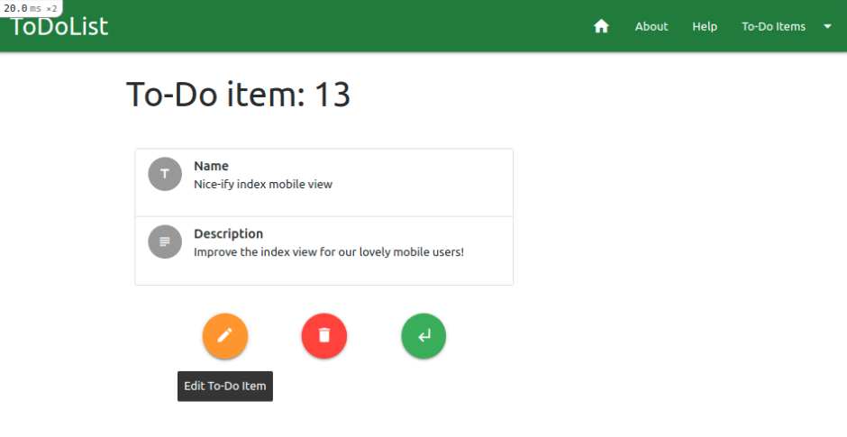
<div class="row hide-on-med-and-down">show view, we can see our lovely new button!
And when you click / tap it, true joy ensues:
Well now, this is looking dangerously professional. At least, it is from the front-end.
From the back end we can see, purely in the show view we've just been working in, that we have a lot of repeating code - the buttons are the chief culprits of this
egregious crime, and we're going to lock them up for it.
"Where?" you ask?
"Why," I respond, again with infuriating levels of childlike excitement, "in some partials, of course!"
As we've already kept a consistent colour and icon theme with our buttons, this will work absolutely brilliantly.
The only thing we need to routinely change in their code is the data-position attribute for the tooltip.
Well, wouldn't you know, Rails lets us pass local variables to our partials, which we can use to pass whichever value we need to the partial!
Let's use the Edit To-Do Item (edit) button as our guinea pig.
First, we'll copy the code for the button and put it in a partial in our todos view directory,
and substitute in a variable for the value of data-position - /app/views/todos/_button_edit.html.erb:
<%= link_to edit_todo_path(@todo),
            class: 'btn-floating btn-large waves-effect orange tooltipped center',
            :"data-tooltip" => 'Edit To-Do Item',
            :"data-position" => (tooltip_pos rescue 'bottom') do %>
  <i class="material-icons">create</i>
<% end %>rescue where we have called the tooltip_pos variable which means that, should we fail to pass the variable to the partial and it error out,
instead if will default to displaying tooltips at the bottom of the button!
Now let's head back to to our show view and swap the list item for the mobile edit button (in the floating-action-btn list) for:
<li><%= render 'button_edit', tooltip_pos: 'left' %></li>(You might need to hold the button for it to appear)
We can also do the same for the other edit button for larger views (the one we added in the row below the collection) and,
because we set the default value of our tooltip_pos variable to 'bottom' with that handy rescue,
we don't even need to specify the position!
<%= render 'button_edit' %>
With this method of fighting bloated code, we can now go forth and do the same for each instance of a button that we're likely to use more than once:
- Back to To-Do Item (
showview) button in theeditview. - Delete To-Do Item (
destroy) buttons in theshow&editviews. - Back to To-Do List (
indexview) buttons in theshow&editviews. - New To-Do Item (
newview) button in theindexview (though only the mobile-friendly one!).
new view, as we're only likely to use this once).
When you have partialised these buttons, you may relax and bask in the glory of your exquisitely handsome app, knowing that all the beauty in the front-end is also reflect under the hood!
With all this excitement, we can't forget our other (non-CRUD) views, which we will be addressing next in our final Materialize-specific section.
For now, though, celebrate with a short desk dance and a push to GitHub!
$ git add -A
$ git commit -m "Show and index views beautified, buttons refactored"
$ git push origin materialize
| < [ToDoList] Materialize III: Forms | | | [ToDoList] Materialize V: Other Pages> |
| Back | ||

Comments
Post a Comment